Help items can be easily styled with CSS to more closely match your company brand. VisualSP gives you styling control at the app level and at the help item level. For styling enterprise-wide branding, such as the look of the help tab, you can find the style section by going to the menu in the Help panel and clicking on Manage My Subscription.

Click on the Applications tab in the management screen menu

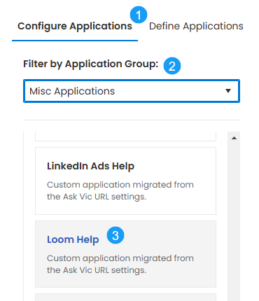
Once the Applications panel opens, click 1) Configure Applications, then 2) Filter by Application Group and finally scroll through the application list and click on the desired application name. In our example we are going to edit 3) Loom Help

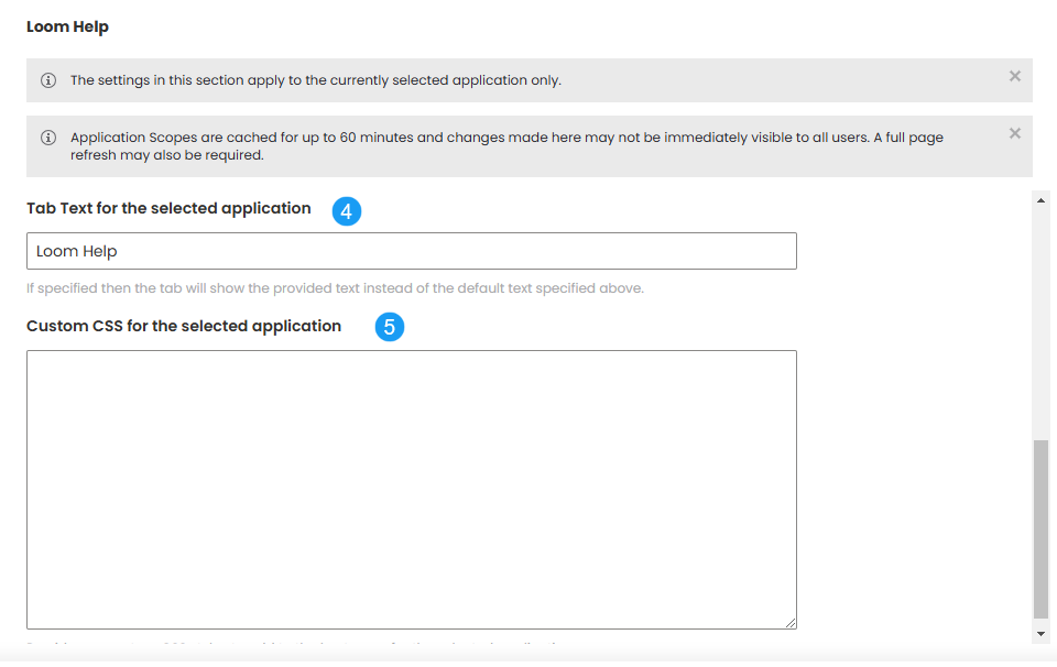
Once you select your application the configuration panel will update with the selected application properties. Scroll down to until you see the following options:

4) is the Tab Text to be displayed for the selected application and 5) is where you can paste your custom CSS for the selected application. No <style> tag is necessary. Just paste the code into the box and remember to save your work.
Selectors that apply to Help items
Tab

- #visualsp-handle
Example CSS for styling the VisualSP tab background color to green and the accompanying text to white:
Banners
In addition to the enterprise-wide styling that is available at the application level, if your goal is to only style a single banner, this can be done in the editing window by clicking View -> Source code:

Add your CSS within <style> </style> tags in the Source Code window.
- .visualsp-banner-container : the main container. Wraps everything and has another class to determine top or bottom (visualsp-banner-container-top and visualsp-banner-container-bottom).
- .visualsp-banner : This is the banner itself and is where the background and foreground color is set. You’d have to use !important to override the colors.
- .visualsp-banner-header : This basically just contains the "x" button which is in a div with the .visualsp-dialog-btns class assigned.
- .visualsp-banner-content : This contains the content as entered by the user. Anything inside this is dependent on what the user provides.
- .visualsp-banner : This is the banner itself and is where the background and foreground color is set. You’d have to use !important to override the colors.
Example CSS for changing the padding of the Banner help item:
Example CSS for changing the position of the Banner close button:
Walkthroughs
Individual Walkthrough steps can be customized either at the source code level, as shown in the Banner example above, but also in the Events section of the Walkthrough Steps editor window:

Add the Set CSS activity and then open the dialogue:

- Select the element you want to change the styling
- Add the style name (ie., background-color, font-size, etc.)
- Add the style value (is., red, 18px)
Here are some additional walkthrough elements you can style:
- .hopscotch-bubble : This is the main container for the bubble and the arrow.
- .hopscotch-bubble-container : This is the main container for the bubble. The width and padding is added directly so you’d need to use !important to override.
- .hopscotch-bubble-number : This contains the step number.
- .hopscotch-bubble-content : This contains the actual content
- .hopscotch-title : an H3 that contains the title.
- .hopscotch-content : Contains the content as entered by the user.
- .hopscotch-actions : Contains the action buttons
- .hopscotch-nav-button : This is a BUTTON element. Will also have .next, .prev, .hopscotch-next, .hopscotch-prev, and hopscotch-cta assigned.
- .hopscotch-bubble-close .hopscotch-close : This is BUTTON element that is the X in the top right corner.
- .hopscotch-bubble-arrow-container : This is the container for the arrow. It also will have .hopscotch-arrow and either .up, .right, .left, .down.
- .hopscotch-bubble-container : This is the main container for the bubble. The width and padding is added directly so you’d need to use !important to override.
Example CSS for changing the walkthrough step number background and removing dependence on image sprite:
Example CSS for changing the walkthrough "next" button to a green gradient:
Example CSS for changing the walkthrough "back" button to a red gradient:
Media Dialogs

- .visualsp-overlay-media : This is assigned to the overlay background that blackens the area around the dialog.
- .visualsp-dialog-media : This is the main wrapper for the dialog
- .visualsp-dialog-title : This wraps the title bar which includes the action buttons in the right corner.
- .visualsp-dialog-title-text : This is assigned to an H1 tag and is the dialog title.
- .visualsp-dialog-btns : This contains the buttons.
- .visualsp-dialog-btn : This represents an individual A element. It will also have .visualsp-dialog-btn-resize class for the resize button, the close and pop-out buttons don’t have a specific class assigned so you’d have to use .visualsp-dialog-btn[title=Popout] or .visualsp-dialog-btn[title=Close dialog] to select them.
- .visualsp-media-iframe : This is an IFRAME element that contains the content – anything inside of this can’t be altered.
- .visualsp-dialog-title : This wraps the title bar which includes the action buttons in the right corner.
Example CSS for changing the media overlay background color to blue:
Example CSS for changing the media overlay title font weight:


